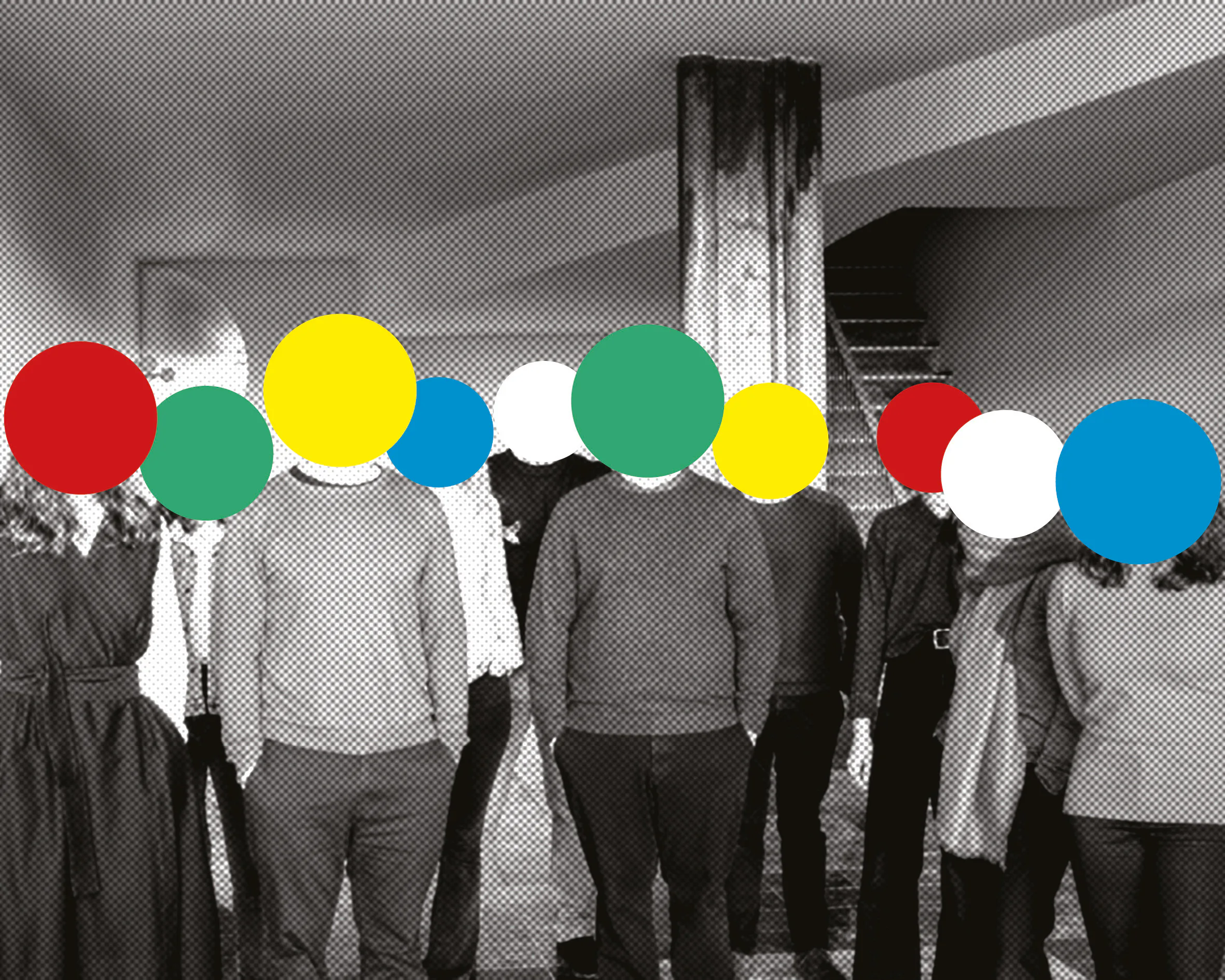


When I think of fala, it is your collages that spring to mind above all else. How important is this tool to your work?
They were very important to us right from the beginning. When we were working in Tokyo, we didn’t have the time or patience for high-resolution renderings, especially before the advent of artificial intelligence. Collages, on the other hand, could be created very quickly and suited the nature of our projects. This form of presentation allowed us to express our ideas directly. They had an immediate impact. And, as you can see, 12 years on, we’re still talking about the consequences of these images. These days, we seldom work with collages; we use more single-line drawings and wireframes instead. This shift enables us to simplify the design during the planning process. The collage has always been one of several tools, not the central component of our architecture.
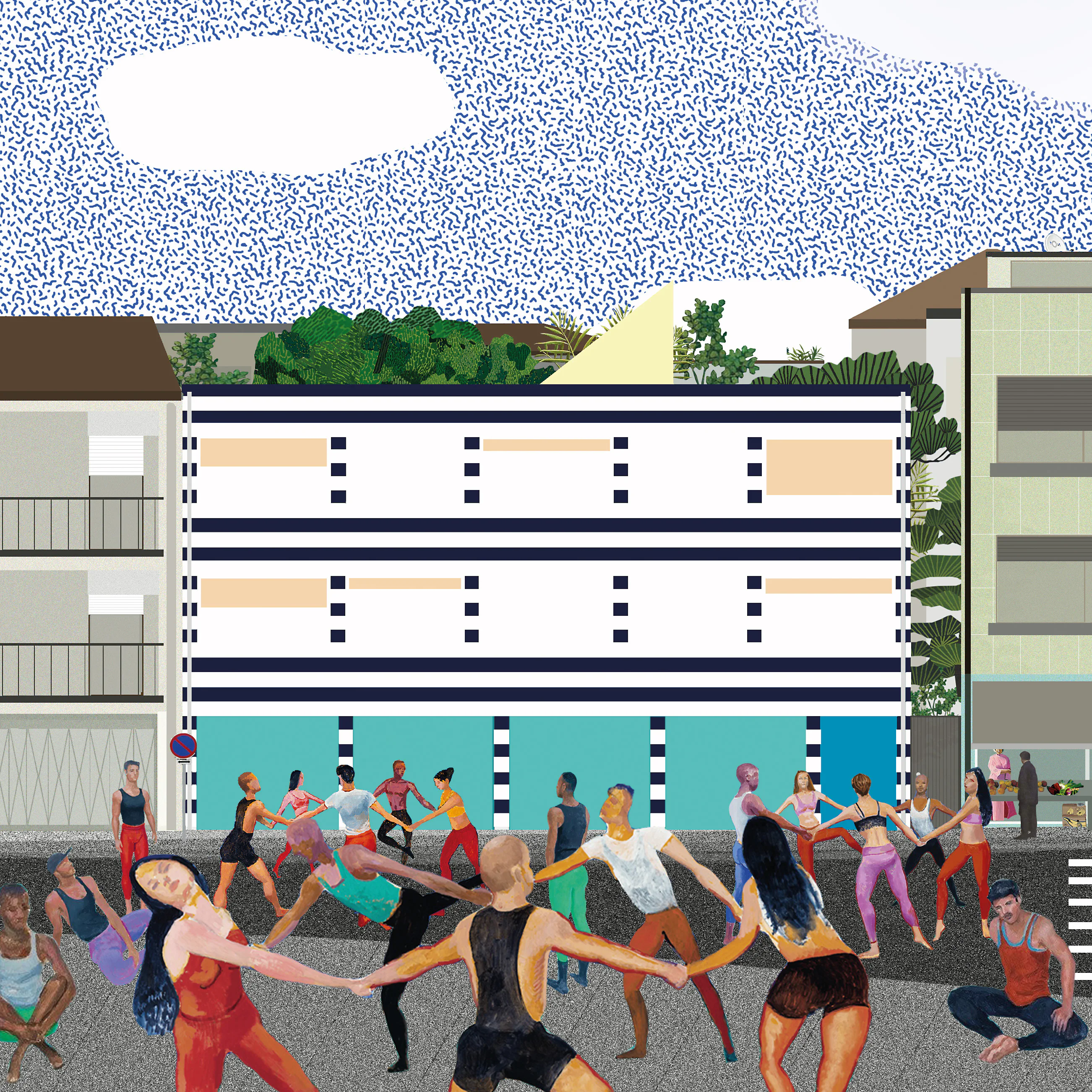
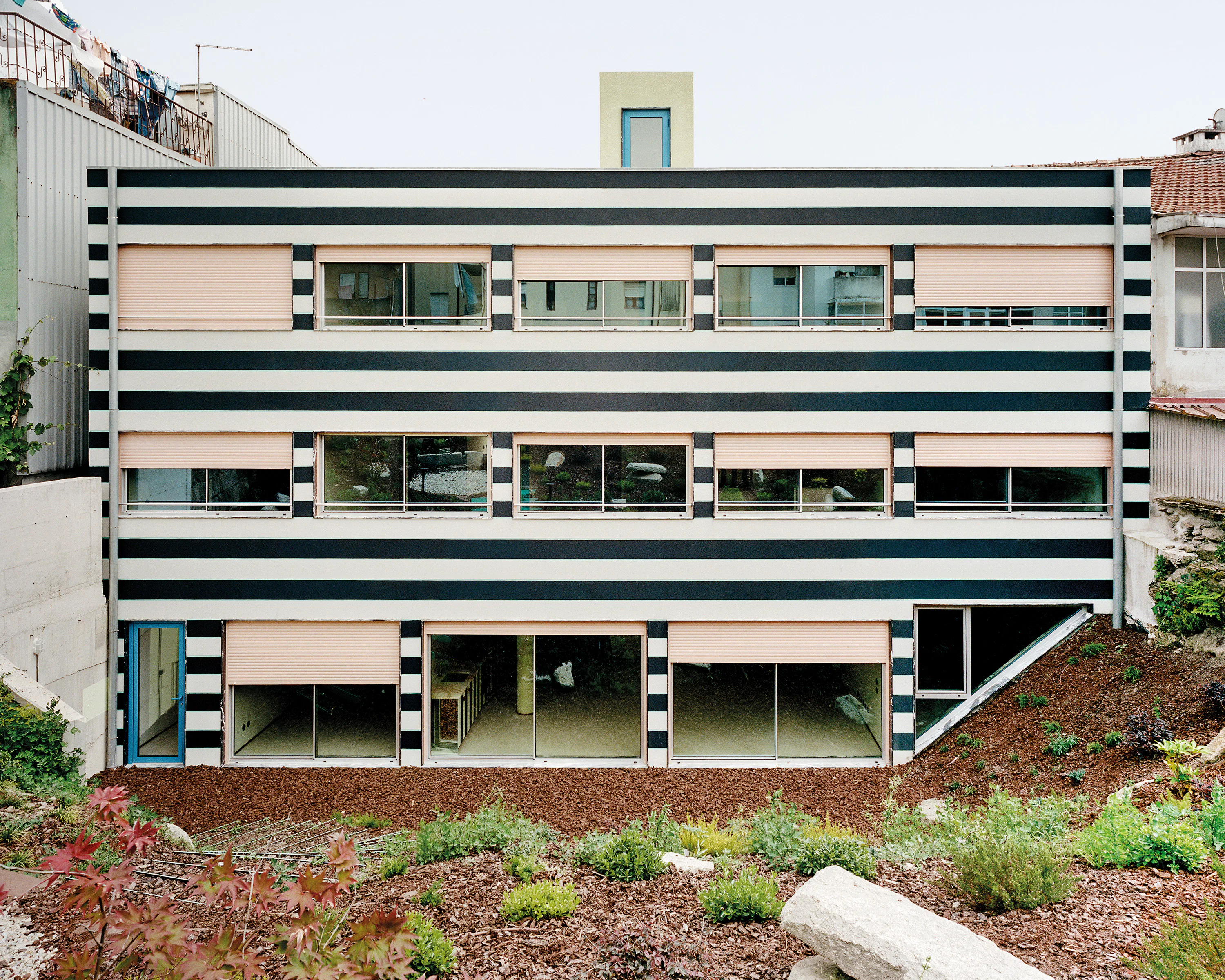
You assign sequential numbers to all your projects. Looking at the 179 housing development in Porto, for example, one can see that the collage and the built architecture tell the same story. What were you trying to highlight with that image?
That project was one of the last in which we used collages in the traditional sense. We wanted to use it to illustrate the project’s contextual challenge: the building is located at a busy junction with many pedestrians and car parking, and there’s a bakery and a hairdresser nearby. The scene made us think of painter David Hockney’s “Dancers”: they occupy the central space and are clearly enjoying themselves. That’s exactly where our design comes in.
We wanted to create a proud building that could also be as prominent and vibrant as the location itself.
However, it should always remain a backdrop to the everyday hustle and bustle. But that’s fine – it is not a museum, but simply a block of flats for five families.
How does the building’s structure respond to its location?
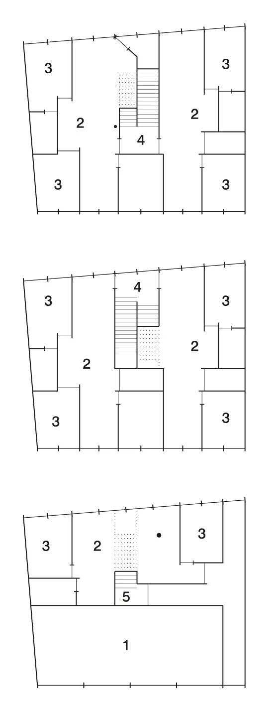
For this project, it was important to build cost-effectively and use resources sparingly. The building’s volume is determined by parameters established in the building regulations. We opted not to include an underground car park, instead planning four parking spaces on the ground floor. This also solved the privacy issue on the ground floor: the flat now faces the inner courtyard because of the parking spaces.
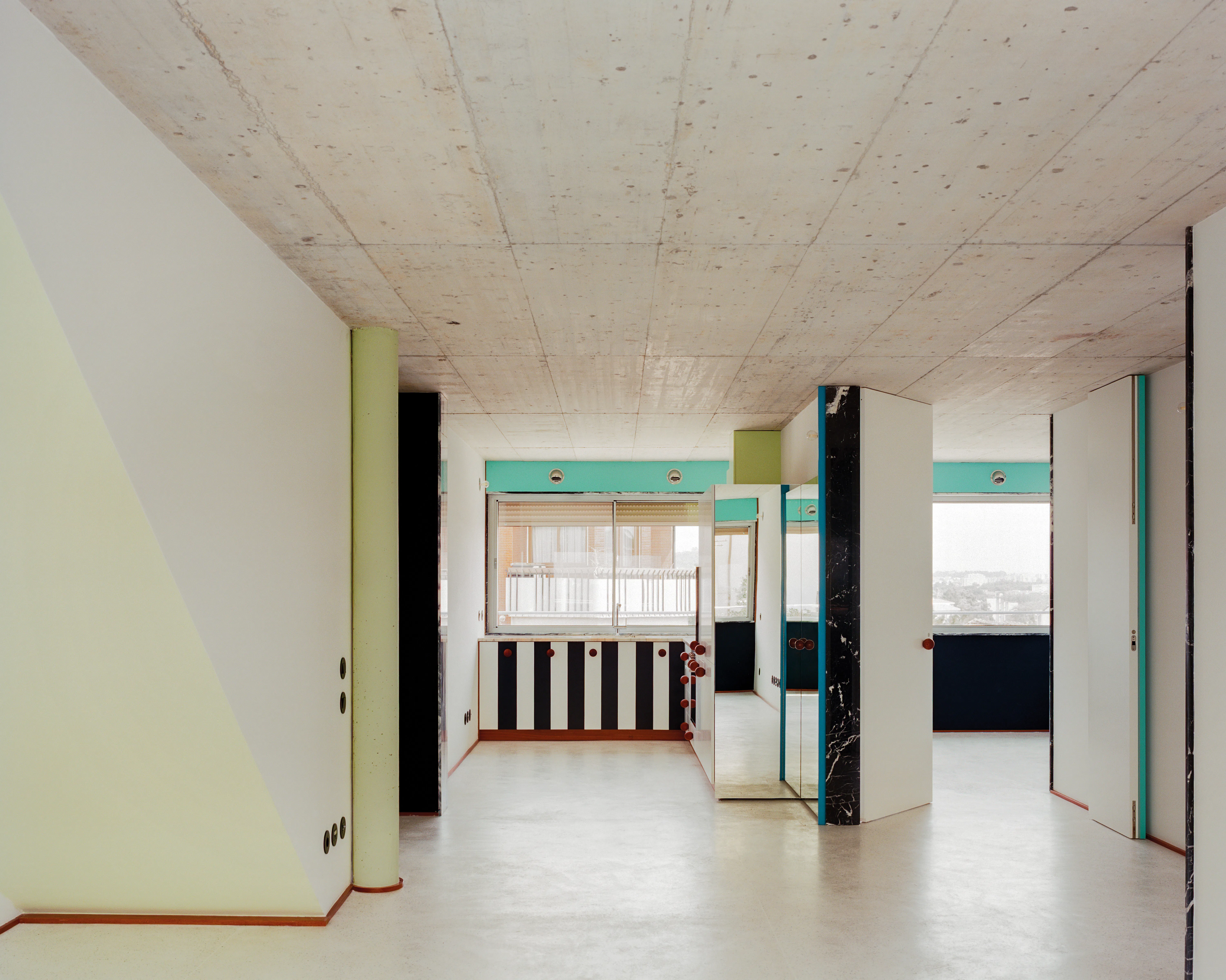
Creating transversal open-plan living spaces on the upper floors maximises the living area while keeping circulation spaces to a minimum. Thanks to the central space, the various rooms maintain a constant visual connection. Furthermore, this space connects the public street with the private garden at the back of the house. All flats are connected by a central, single-flight staircase. The excess spaces above and below the staircase have also been incorporated into the central living area. This makes the relatively small flats appear larger than they actually are.
The interiors come across as high-end in the photos. What is the material strategy behind that?
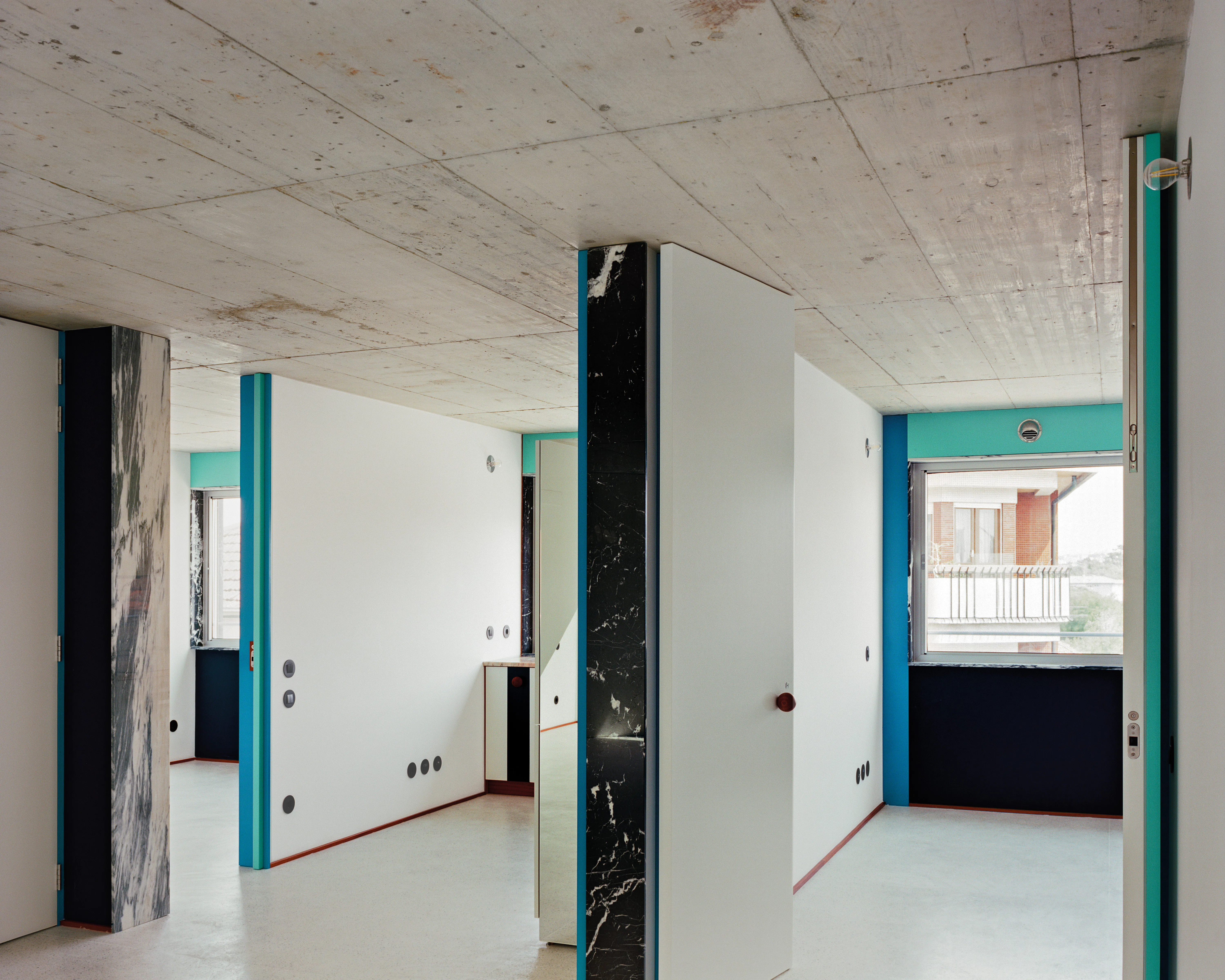
Through a deliberate choice of materials and contrasting colours, the interior and exterior spaces appear very opulent. However, on closer inspection, it becomes clear that we’ve used our resources sparingly: a little natural stone in the door and window reveals; colours we’ve deliberately chosen to create contrasts; and a few elegantly designed door handles. The terrazzo and window profiles are standard-issue.
“We’ve used our resources sparingly:
a little natural stone in the door and window reveals; colours we’ve deliberately chosen to create contrasts; and a few elegantly designed door handles.”


Certain similarities to Project 179 can be seen in the 215 flat refurbishment in Porto. Yet the atmosphere is different. How did that come about?
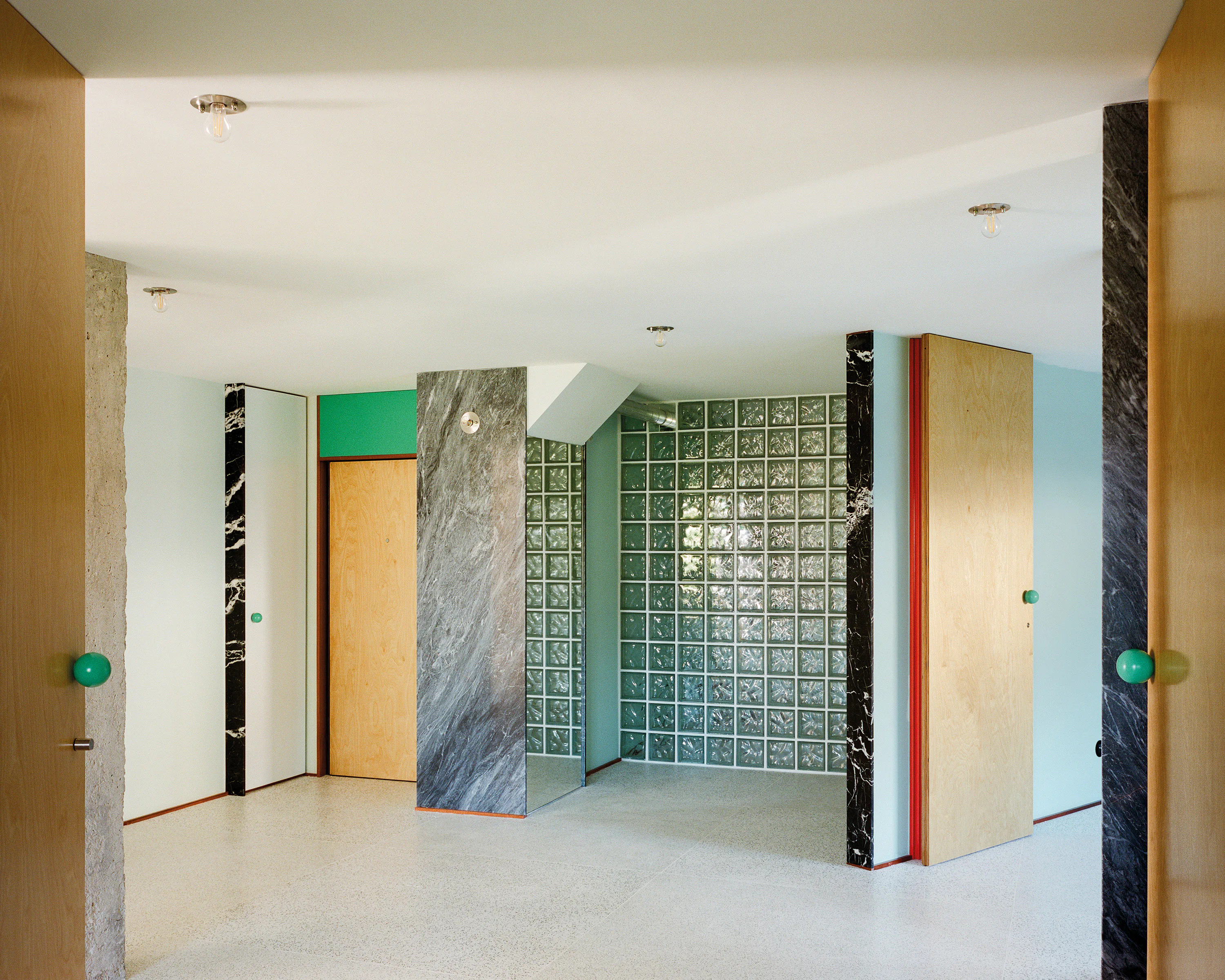
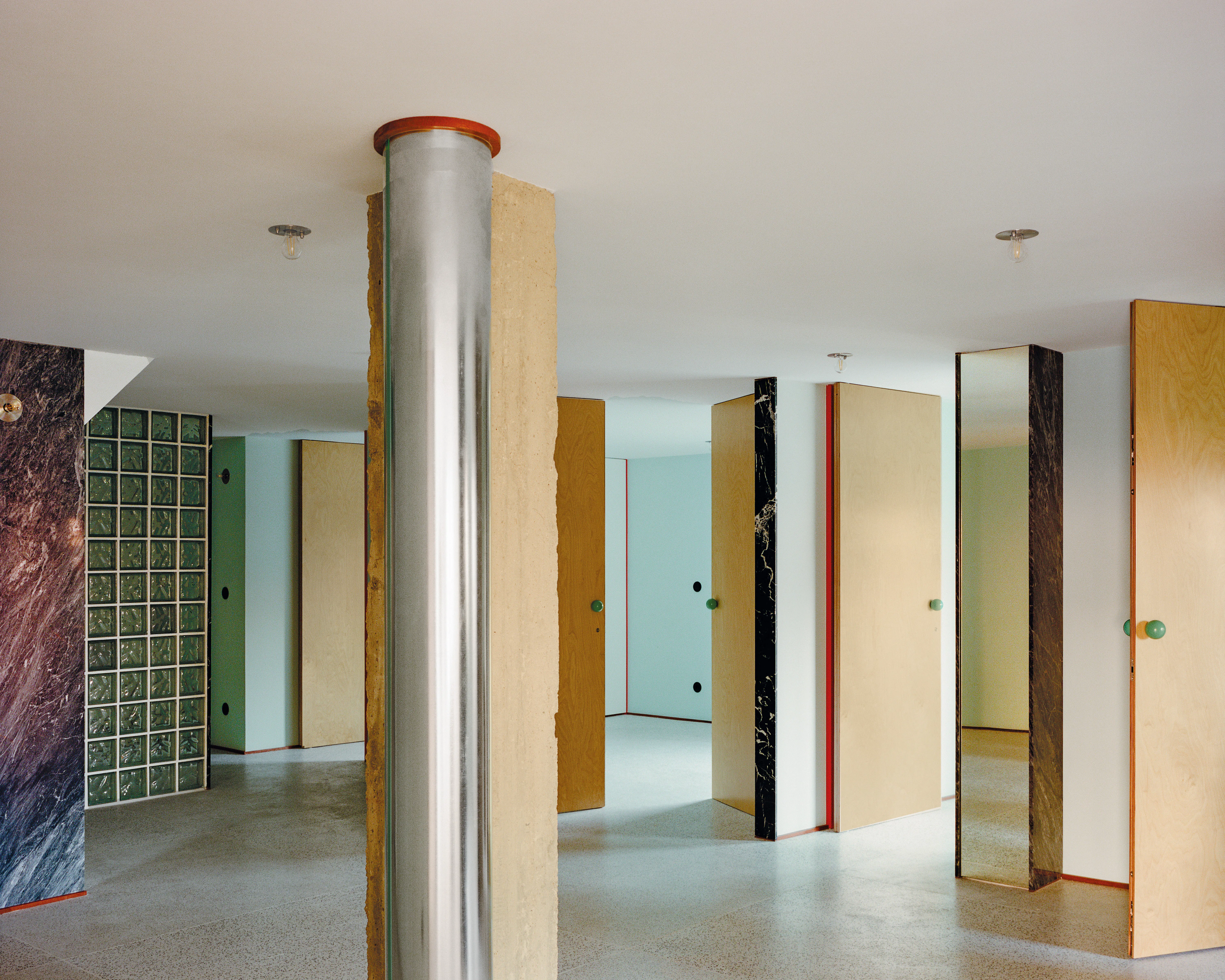
In 215, we tried to refine and build on the same approach. This involved adding a few stone accents and touches of colour, as well as using the same terrazzo flooring and the same carpentry details for the doors and cabinetry. However, this project involved redesigning just one flat. Our spatial ideas were very well received by the family right from the start. We wanted to merge all internal circulation and social areas, and make the large internal hallway-like space the beginning of a continuous promenade. The two children were very young at the time, and this centrally located space was perfect for an open-plan play area. Today, there is a carpet there. Along with the kitchen, this room forms the heart of the flat. The family also responded positively to our suggestion of adding a second door to some of the rooms, for greater spatial ambiguity and fluidity. Thanks to our close collaboration with the clients, we made substantial progress. For me, this is one of our most successful projects, regardless of its limited scale.
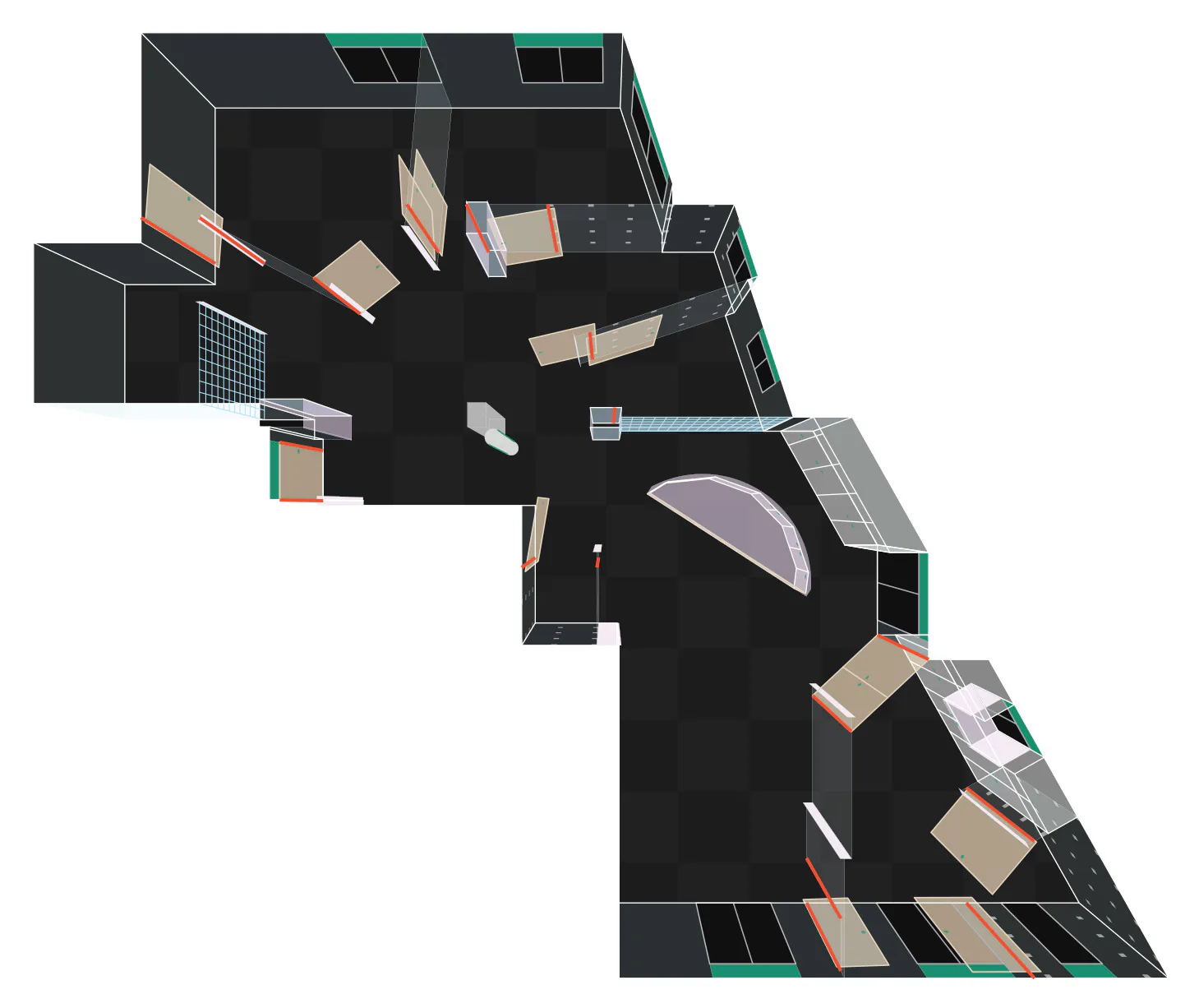
When I compare the floor plans of the two projects, the multistorey block seems clearer to me. But when I view the images, I find Project 215 more atmospheric and calmer. Why is that?
I think the strong colour contrast of the block of flats is misleading. If the walls in both projects were simply white, it would be easier to see that the renovation creates a much more dynamic space – and therefore a more atmospheric one – but also a less stable one. Imagine you have a column in front of a wall. Paint it in three different ways: once in the same shade as the wall; once in a lighter shade; and once with blue and white stripes. Each time, the varying degree of contrast changes the relationship between the two elements, even though it is always the same column and wall.
“Which colour clashes most with nature? White. Imagine a white box in a forest, in the middle of a desert, or right by the water.”
Would you say you’ve developed a kind of “pattern language” through standardised details, which – combined with deliberate colour and material contrasts – characterises your architecture?
Our projects are always different, but many details are similar, which is typical of Portuguese architecture. We have used the same window profile in dozens of building projects because it is beautifully delicate and cost-effective. Furthermore, we have been working with basically the same two carpentry details on at least 50 projects. While the doors and hinges are similar, the colour of the door and the finishing of its frame make a huge difference. This lends our designs an unexpected creative complexity.
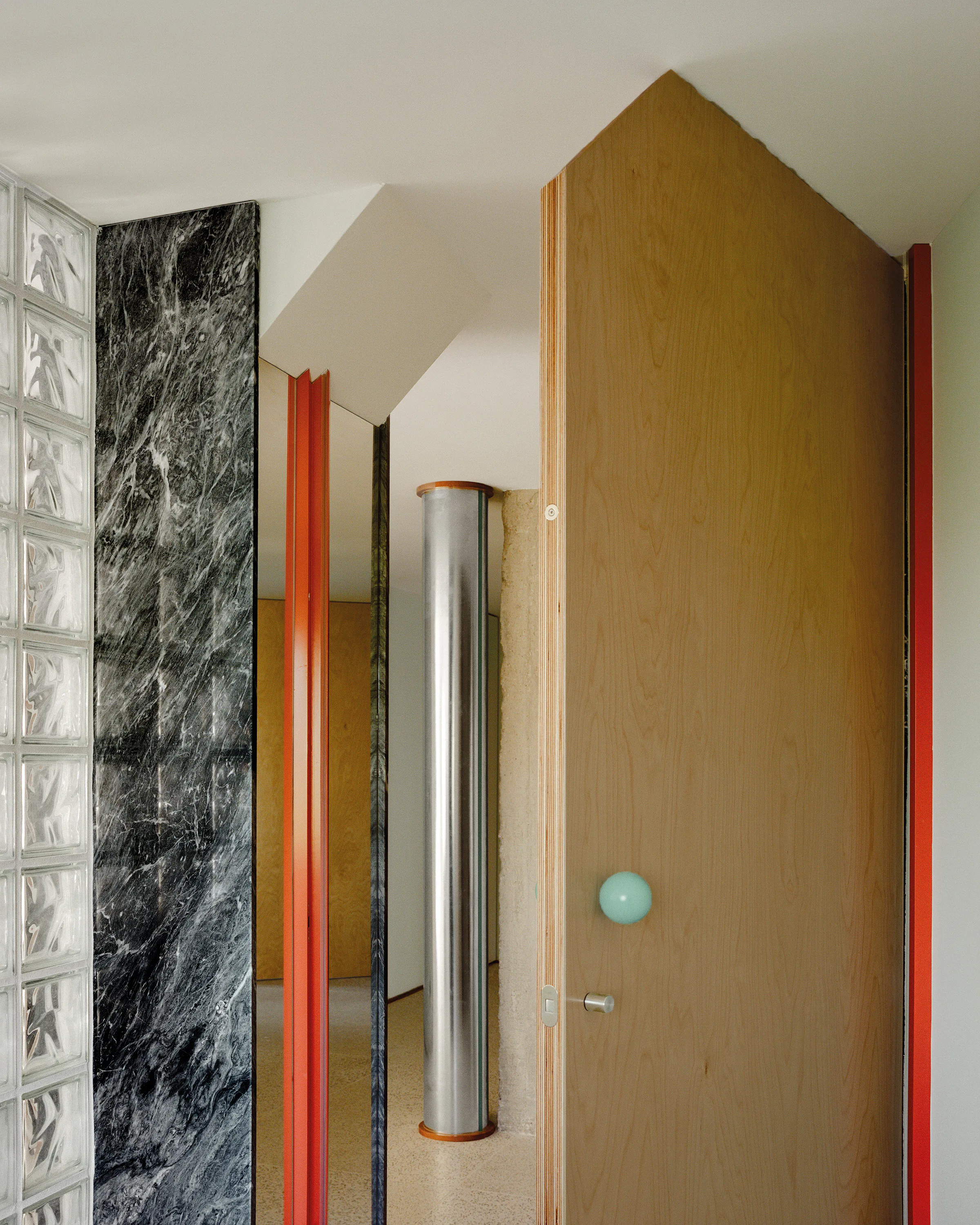
Why do contrasts play such an important role in your work?
Let me answer that question with another question. Which colour clashes most with nature? White. Imagine a white box in a forest, in the middle of a desert, or right by the water. It’s the most artificial thing you can imagine. Yet it has a peaceful effect on people, who accept it. It’s important to note that this wasn’t always the case. In the 1930s, ‘40s, and ‘50s, cars, houses, and interiors featured a variety of colours and contrasts. However, the sterile economy of “good” taste has reduced everything to monotonous, dreary tones of white, grey, and beige.
What role do materials and contrasts play in projects with a tight budget?
In 179, we used marble on just one percent of the total wall area. Added to this are the colour accents inside and the painted facade outside – both of which just make effective use of paint. Combined with space-saving floor plans without corridors, these design decisions allowed us to create affordable flats. Ultimately, the city bought the building and these are now public housing. We see this as a great compliment, and we hope it happens more often.
The housing market in Portugal’s cities is under severe pressure. How do you address this in your work and teaching at EPFL in Lausanne?
Social housing in Europe has historically been built to look like social housing. Perhaps this is due to the glorification of social housing programmes from the 1960s and ‘70s. We don’t think it has to be that way. That’s why we aim to be prouder, even with the most modest commissions. For instance, we use stripes on the facade to convey the message, “We have limited funds, but we’re using them wisely.” Or a red front door whose design conveys: “I’m proud to be a door.” If, by the end of our careers, we have realised 20 such projects that have a cultural impact on their surroundings, or on the discipline at large, we will be satisfied.
At EPFL, we explore the same questions. Under the heading “good housing”, we have worked with our students on Portuguese architecture competitions from the past six years as design briefs. Students were asked to demonstrate missed opportunities in those competitions by showing how they could devise better solutions within the same conditions and budget. And they succeeded in doing so. The typological diversity of the designs was enormous. They showed how different families could live together in one house without encroaching on each other’s space. We went into even greater detail in the models, discussing aspects such as the colour of skirting boards and the tile pattern in two adjoining rooms. It was an impressive experience.